Triage: Designing a pattern detection UX for telemetry analysis
Role: Sole UX designer. Designed the Triage experience from the ground up helping turn complex trace data into actionable insights.
Year: 2024
What is triage?
Triage is a feature designed to help developers spot unusual patterns across vast amounts of telemetry data, fast. Integrated within a broader observability tool, it surfaces correlations between user actions, services, and traces, removing the guesswork from debugging.
Problem
With OpenTelemetry, collecting telemetry is easy. But finding what's important, what’s actually worth a developer’s attention is the hard part. Developers were spending too much time scanning trace data, clicking through spans, and guessing what might be related.
Process & Design Highlights
- Collaborated with engineers to understand how correlation logic works and how it should be visualized
- Prototyped and tested span-based triage UX on top of existing trace heatmaps
- Designed the interaction model around selecting and comparing trace clusters
- Created a tiered system of visual cues to explain correlation, frequency, and confidence
- Developed microcopy and tooltips to guide users through advanced technical feedback
- Wrote technical documentation
Outcome & Impact
The Triage feature was tested with real customers and successfully launched in front of 900+ engineers at KubeCon London 2025. It proved effective in both production environments and live demos.
- Accelerated root cause analysis, reducing time to insight for performance-related issues
- Lowered the barrier to entry for less experienced engineers by surfacing meaningful patterns automatically
- Increased trust in the platform’s ability to guide investigations turning raw telemetry into actionable insight
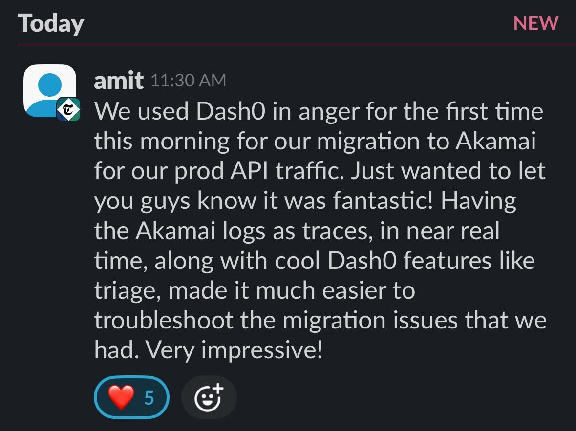

This is me happily testing triage live with engineers.
This is me happily testing triage live with engineers.
Key takeaways/ use cases:
- Use the Triage feature to analyze traces across different request types.
- Identify and filter error patterns within spans.
- Use time range selection to investigate anomalies.
Tools & stack
Figma, Custom telemetry SDKs, OpenTelemetry, Posthog, Prometheus.
What I Learned
This project pushed my understanding of how data, UX, and developer psychology intersect. I learned how to translate complex correlation logic into an interface that tells a clear story, and helps engineers act on it quickly.
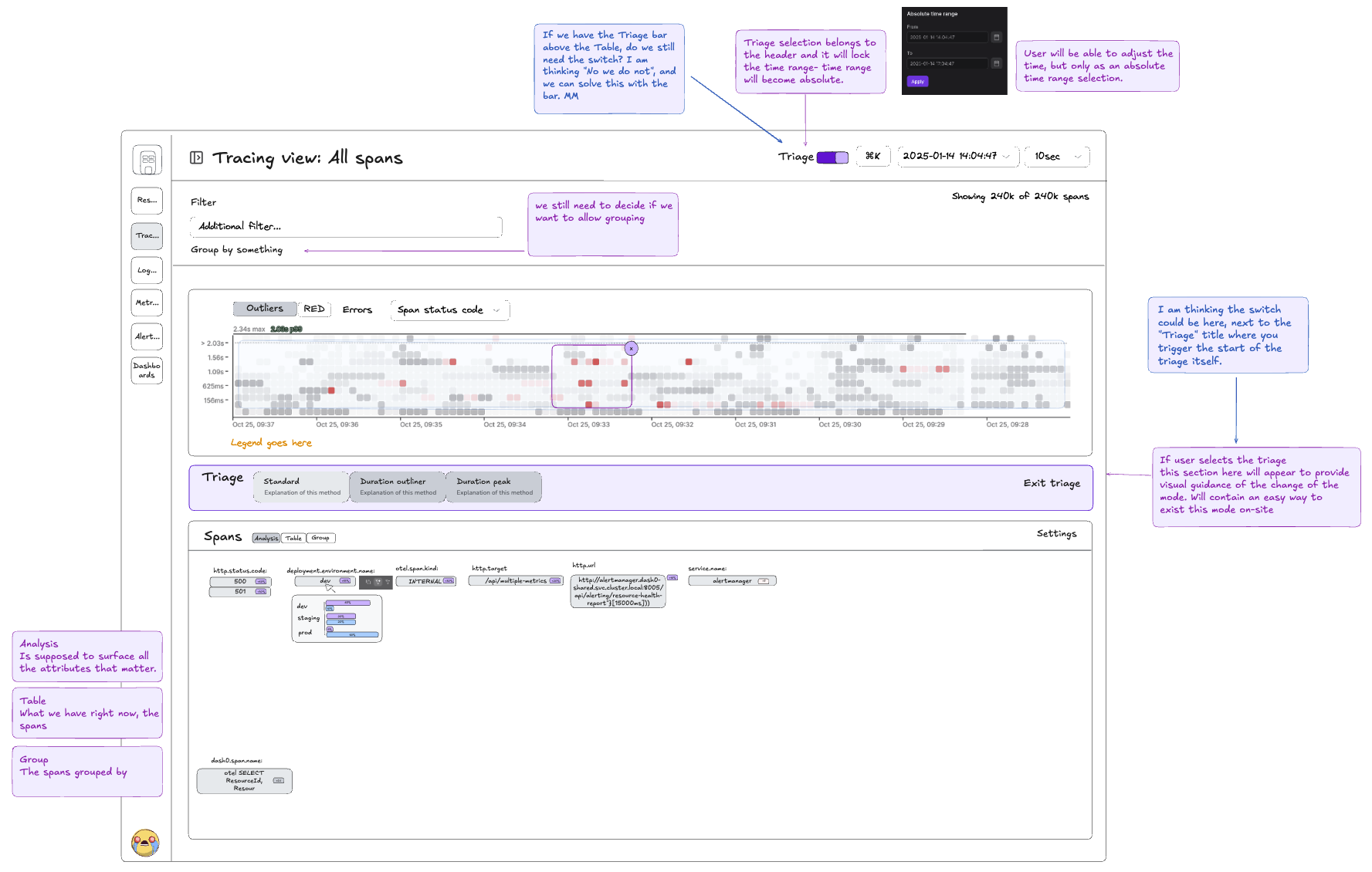
Image of the definitions in excalidraw
Feature drill down
The quickest way to find the needle in the telemetry haystack
Think of this data like a haystack. The more you collect, the harder it becomes to find the important pieces. Sure, cutting down on unnecessary data helps, but the real value comes from making your data more useful.
That’s where Triage comes in. Instead of digging through piles of logs and metrics, you just point to an area you're curious about, and Triage highlights the key patterns, unusual behavior, and possible causes for you.
Triage concepts
Color coding
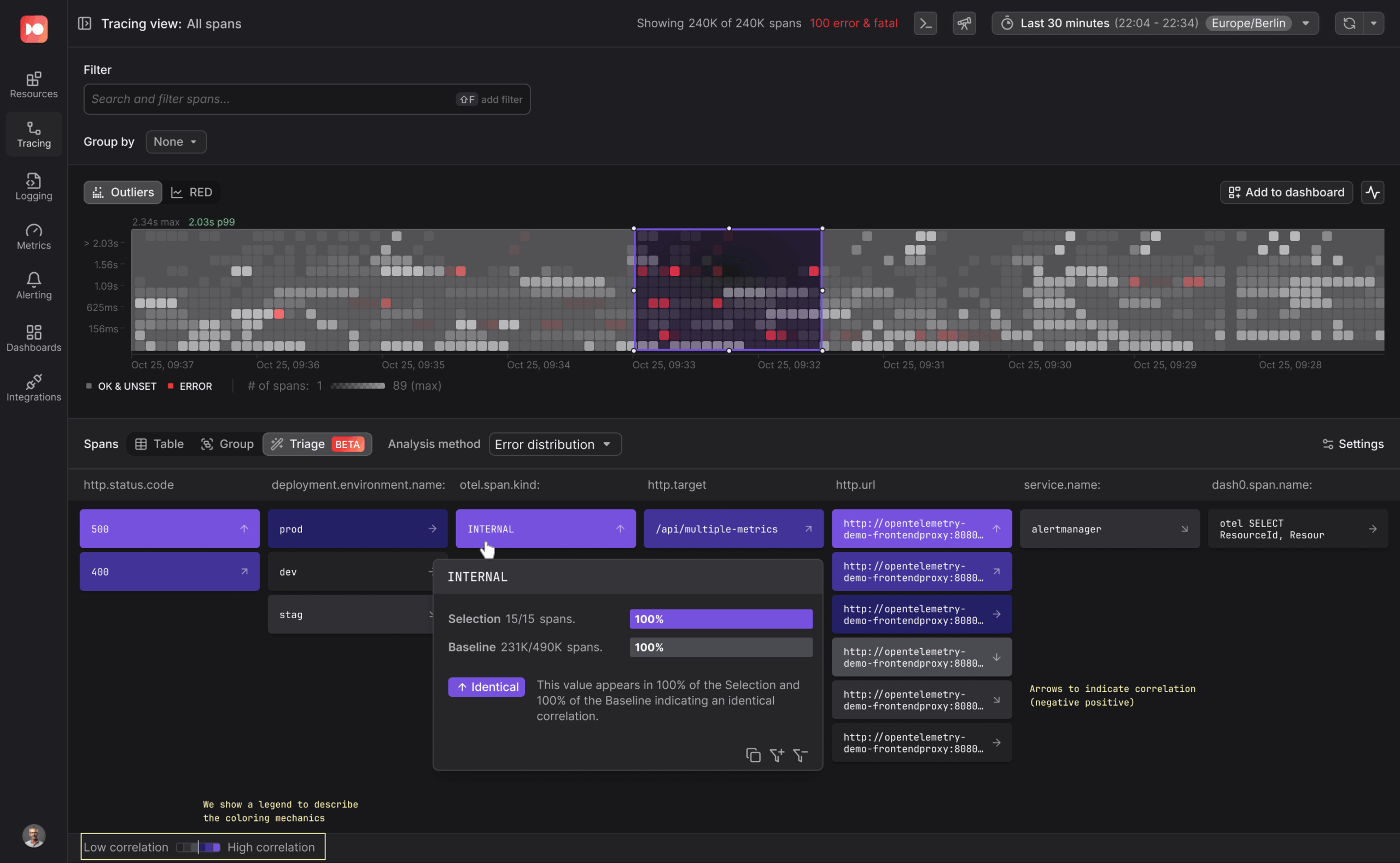
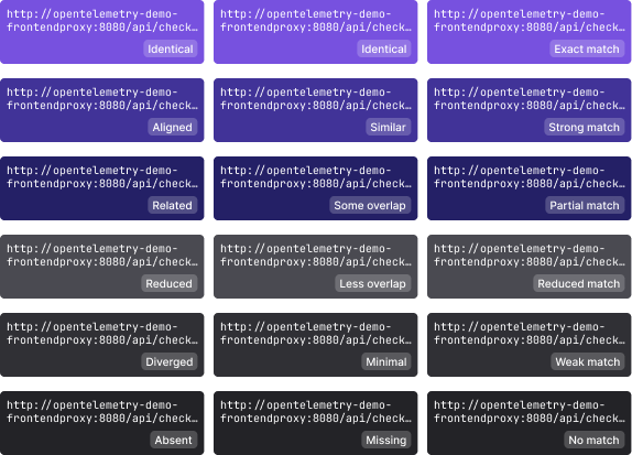
The rows in the attribute distribution table use distinct colors and varying intensities to visually differentiate values, making it easier to identify patterns and correlations.
Selection
In Triage, Selection refers to the specific data points you highlight, typically by drawing a box to indicate what interests you. Dash0 then analyzes this selection to uncover patterns, anomalies, and key characteristics that make it unique.
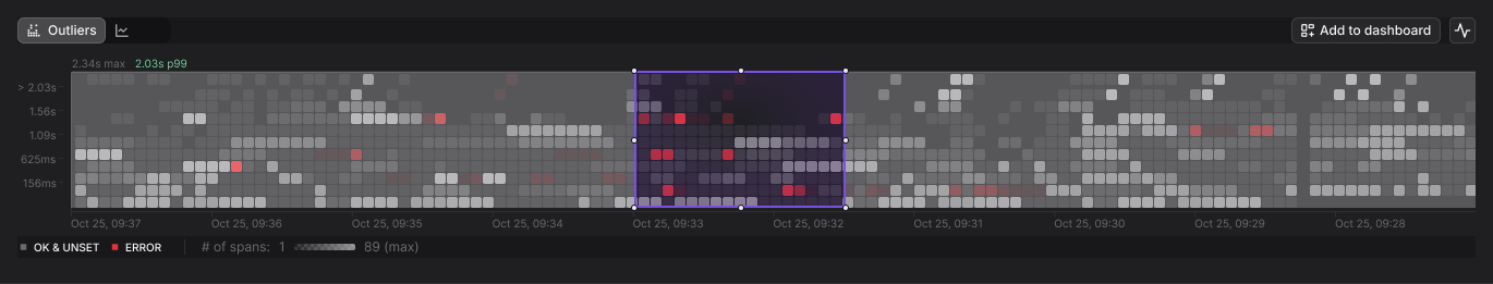
Baseline
The Baseline serves as the reference dataset against which the selection is compared. By contrasting your selection with the baseline, you will identify deviations, similarities, and trends, helping you quickly understand why the selected data stands out. Triage supports a variety of possible baselines like “Global Timeframe” or “Previous Timeframe”.
Correlation
Triage uses correlation analysis to compare your Selection against the Baseline, highlighting key attributes that differentiate them.
💡Hovercards provide additional information about the correlation, including the possibility to copy, zoom in, or filter based on this attribute for deeper analysis.
In the following example the hovercard highlights how the "opentelemetry-demo-frontend" attribute is distributed in the Selection vs. the Baseline:
Selection: 100% (15/15 spans) → Fully present in the selected dataset.
Baseline: 47% (231K/490K spans) → Common but not dominant in the overall dataset.
+53% Positive Correlation → This attribute appears significantly more often in the selection, making it a key differentiator.
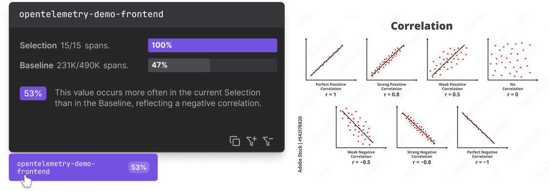
💡Each cell includes a percentage, which quantifies the relative prominence of an attribute value compared to the entire dataset.
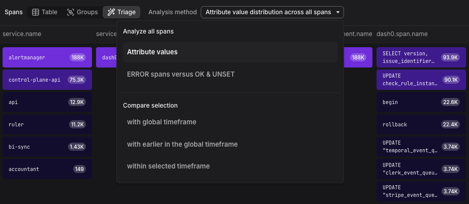
Analysis methods
Compare Selection with Global Time range
Comparing a specific selection against the overall time range is an effective way to identify anomalies and gain insights into new or poorly understood issues.
Compare selection with earlier in the time frame
Analyzing telemetry data from before the selected timeframe helps identify the first occurrence of spikes or error clusters, providing insights into their origins.
Compare Selection within Selected Timeframe
Comparing a selection against the surrounding data within the chosen timeframe provides a useful starting point for analyzing new or unfamiliar issues.
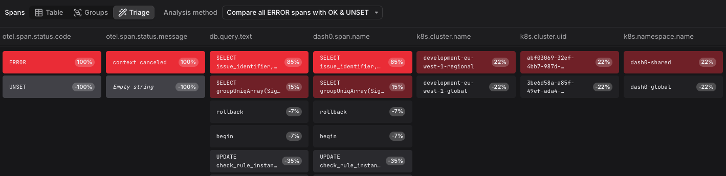
Triaging errors
This view helps developers quickly identify which attributes and patterns are most associated with errors across large trace datasets. I designed it to surface meaningful correlations at a glance, so teams can move from symptom to root cause faster, without manually inspecting thousands of spans.
andreachomiak@gmail.com | LinkedIn
© 2025 Andrea Chomiak